
Android(Compose)
Component Overview
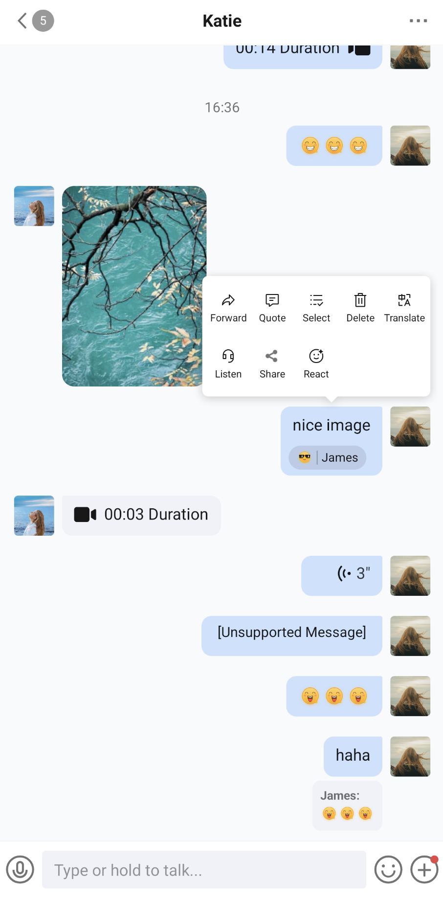
MessageList is a message list component built with Jetpack Compose. It is used to display and manage chat messages. It provides complete support for displaying message types:
Supported message types: text, image, video, voice, file, emoji, merge and forward, call records, system notifications, and more. You can also display custom business messages with a custom renderer.
Message actions: supports long-press menu actions, such as copy, forward, quote, multi-select, delete, recall, speech-to-text, translate, react, and custom actions.
Highly customizable: supports multiple style settings (such as alignment, avatars and nicknames, spacing, list background, and bubble appearance), as well as message filtering, custom message rendering, and custom action items.
Chat Message List | Message Long-Press Menu |
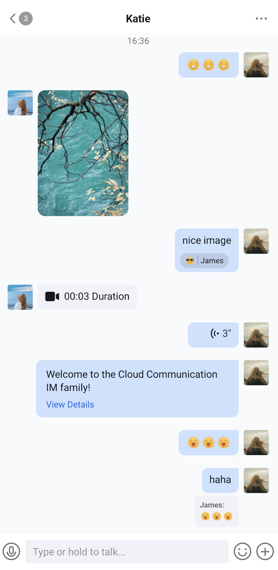 | 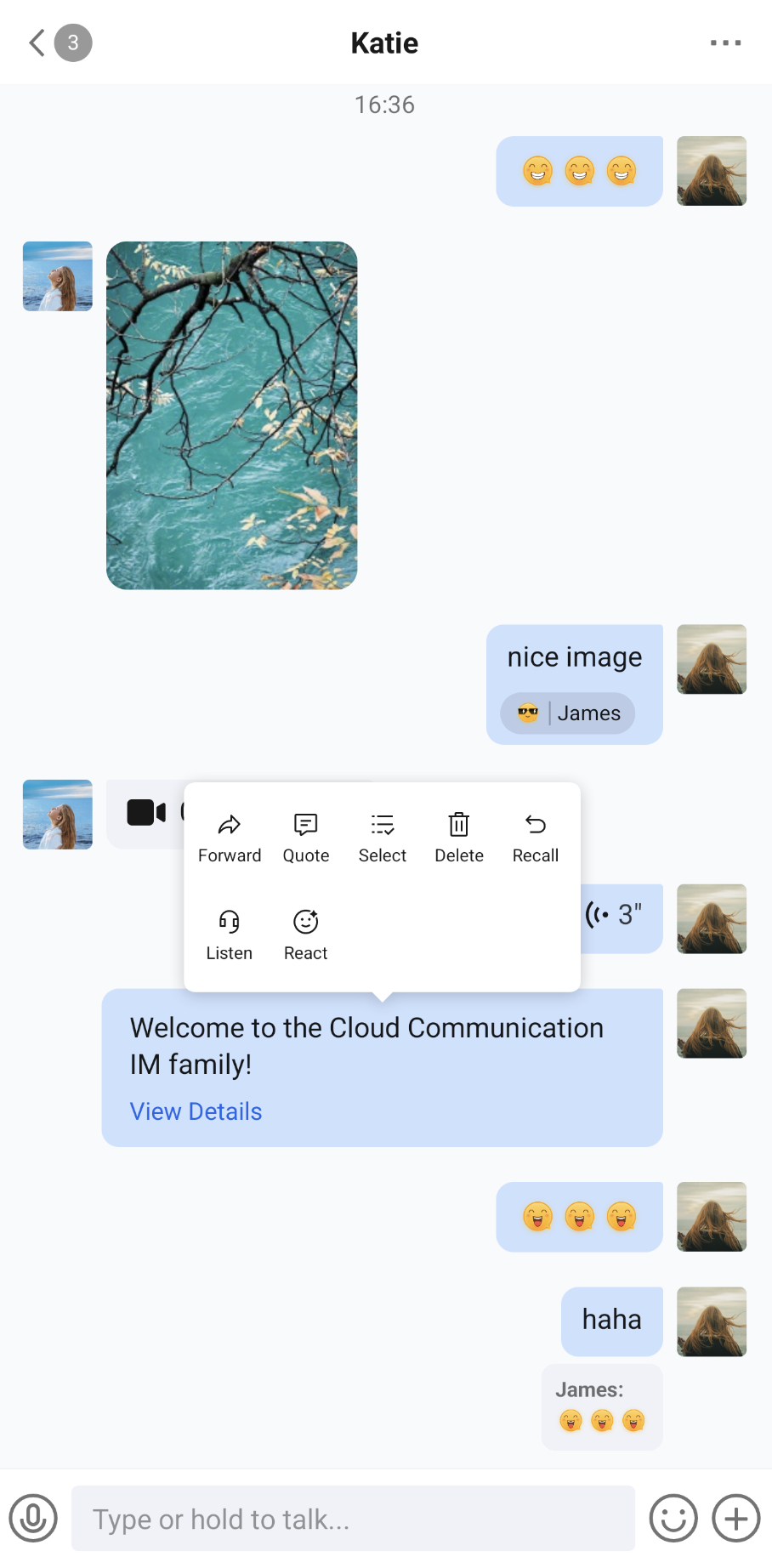 |
Component Integration
MessageList is a component of TUIKit Compose. Integrate TUIKit Compose to get and use ConversationList. For detailed integration steps, see the TUIKit Compose documentation.
Component Structure
MessageList exposes the initialization method of the message list and
MessageListController, which controls the message list from outside the component. All other logic is encapsulated in MessageList.Public Methods
Method | Parameter | Description |
MessageList | conversationID: String | Initializes the component and sets the conversation ID. For a one-to-one chat, the format is c2c_userID. For a group chat, the format is group_groupID. |
| modifier: Modifier | Jetpack Compose modifier for setting style, layout, behavior, and appearance. |
| config: MessageListConfigProtocol | Initializes the component and sets the message list style, action items, message filtering, and custom rendering rules. The default value is ChatMessageListConfig(). |
| customActions: List<MessageCustomAction> | Initializes the component and sets custom message menu options, which are appended after the default action items. |
| locateMessage: MessageInfo? | Initializes the component and sets the message to locate. Typically used to jump from the message search results page to the message page and locate the target message. |
| messageListViewModelFactory: MessageListViewModelFactory? | Factory for creating the internal MessageListViewModel. In most cases, you do not need to create it manually. The component already provides a default implementation. |
| controller: MessageListController? | Message list controller. Optional. Create it with rememberMessageListController() and pass it in to exit multi-select mode, send the typing status, and perform other actions from outside the component. See MessageListController below. |
| onTypingStatusChanged: (Boolean) -> Unit | Callback for changes to the other user's typing status. true means the other user is typing. It takes effect only in one-to-one chats when enableTyping in config is true. |
| onMultiSelectStateChanged: (Boolean) -> Unit | Callback for multi-select mode state changes. true means multi-select mode is entered, and false means multi-select mode is exited. |
| onUserClick: (String) -> Unit | Initializes the component and sets the handler for user avatar clicks. The callback parameter is the userID of the clicked user. |
MessageListController
After you create a MessageListController with
rememberMessageListController() and pass it to the controller parameter of MessageList, you can control the message list from outside the component:Method/Property | Description |
exitMultiSelectMode() | Exits multi-select mode. |
isInMultiSelectMode(): Boolean | Whether the component is currently in multi-select mode. |
sendTypingStatus(isTyping: Boolean) | Sends your typing status to the other user. It is typically used with the typingStatusSender of MessageInput. It takes effect only in one-to-one chats when enableTyping is true. To reduce unnecessary messages, it is sent only when the other user has sent you a message within the last 30 seconds, and sending is rate-limited. |
typingState: StateFlow<Boolean> | Whether the other user is typing. This has the same effect as the onTypingStatusChanged callback. |
Basic Usage
You can initialize and use the MessageList component directly. You need to provide a conversation ID. We also recommend that you implement
onUserClick in the initialization method.import androidx.compose.foundation.layout.Boximport androidx.compose.foundation.layout.fillMaxSizeimport androidx.compose.foundation.layout.systemBarsPaddingimport androidx.compose.runtime.Composableimport androidx.compose.ui.Modifierimport io.trtc.tuikit.chat.uikit.components.messagelist.ui.MessageList@Composablefun MessageListScreen(conversationID: String, onOpenUserProfile: (userID: String) -> Unit) {Box(modifier = Modifier.fillMaxSize().systemBarsPadding()) {MessageList(conversationID = conversationID) { userID ->// Handle the user avatar click eventonOpenUserProfile(userID)}}}
Use with MessageInput
MessageList only displays messages. It is typically combined with MessageInput to form a chat page. The following example uses
MessageListController so the two components work together: hide the input box in multi-select mode, press the back button to exit multi-select, and show a "The other user is typing" prompt.import androidx.activity.compose.BackHandlerimport androidx.compose.foundation.layout.Columnimport androidx.compose.foundation.layout.fillMaxSizeimport androidx.compose.foundation.layout.paddingimport androidx.compose.foundation.layout.systemBarsPaddingimport androidx.compose.material3.Textimport androidx.compose.runtime.Composableimport androidx.compose.runtime.getValueimport androidx.compose.runtime.mutableStateOfimport androidx.compose.runtime.rememberimport androidx.compose.runtime.setValueimport androidx.compose.ui.Modifierimport androidx.compose.ui.unit.dpimport io.trtc.tuikit.chat.uikit.components.messageinput.ui.MessageInputimport io.trtc.tuikit.chat.uikit.components.messagelist.ui.MessageListimport io.trtc.tuikit.chat.uikit.components.messagelist.ui.rememberMessageListController@Composablefun ChatScreen(conversationID: String) {val messageListController = rememberMessageListController()var isPeerTyping by remember { mutableStateOf(false) }var isMultiSelectMode by remember { mutableStateOf(false) }// In multi-select mode, press the back button to exit multi-selectBackHandler(enabled = isMultiSelectMode) {messageListController.exitMultiSelectMode()}Column(modifier = Modifier.fillMaxSize().systemBarsPadding()) {if (isPeerTyping) {Text(text = "The other user is typing...", modifier = Modifier.padding(16.dp))}MessageList(conversationID = conversationID,modifier = Modifier.weight(1f),controller = messageListController,onTypingStatusChanged = { isTyping -> isPeerTyping = isTyping },onMultiSelectStateChanged = { isMultiSelect -> isMultiSelectMode = isMultiSelect },onUserClick = { userID ->// Handle the user avatar click event})// Hide the input box in multi-select modeif (!isMultiSelectMode) {MessageInput(conversationID = conversationID,typingStatusSender = { isTyping ->// Send your typing status to the other usermessageListController.sendTypingStatus(isTyping)})}}}
Note:
The sample project (demo) provides ChatActivity, a chat page built on ChatPage (with a title bar, an unread badge, group event handling, and more). You can reuse it directly or refer to its implementation for customization: ChatActivity.start(context, conversationID).
Customization
You can customize the message list style, action items, which messages are displayed, and how custom messages are rendered. The methods are as follows.
Custom Styles
We recommend using
ChatMessageListConfig to set the style. All constructor parameters of ChatMessageListConfig are optional named parameters. Properties that are not set use the default values:import androidx.compose.ui.unit.dpimport io.trtc.tuikit.chat.uikit.components.config.MessageAlignmentimport io.trtc.tuikit.chat.uikit.components.messagelist.config.ChatMessageListConfigimport io.trtc.tuikit.chat.uikit.components.messagelist.ui.MessageListval messageListConfig = ChatMessageListConfig(alignment = MessageAlignment.TWO_SIDED, // Messages you send are on the right, and messages from others are on the leftisShowRightAvatar = false, // Do not show the avatar on the right (messages you send)isShowTimeMessage = false, // Do not show time separatorscellSpacing = 16.dp, // Spacing between messageshorizontalPadding = 12.dp // Left and right margins of the message list)MessageList(conversationID = conversationID, config = messageListConfig) { userID ->// Handle the user avatar click event}
Style-related properties of
ChatMessageListConfig are described below. For switches related to action items, see "Custom Action Items":Property | Type | Description | Remarks |
alignment | MessageAlignment | Message alignment | MessageAlignment.LEFT: All messages are left-aligned.MessageAlignment.RIGHT: All messages are right-aligned.MessageAlignment.TWO_SIDED: Messages you send are right-aligned, and messages from others are left-aligned.The default value is TWO_SIDED. |
isShowTimeMessage | Boolean | Show time messages | Controls whether time separators are displayed between messages. The default value is true. |
isShowLeftAvatar | Boolean | Show left avatar | Controls whether messages displayed on the left show an avatar. With TWO_SIDED alignment, these are messages sent by others. The default value is true. |
isShowLeftNickname | Boolean | Show left nickname | Controls whether messages displayed on the left show a nickname. The default value is true. |
isShowRightAvatar | Boolean | Show right avatar | Controls whether messages displayed on the right show an avatar. With TWO_SIDED alignment, these are messages you send. The default value is true. |
isShowRightNickname | Boolean | Show right nickname | Controls whether messages displayed on the right show a nickname. The default value is true. |
cellSpacing | Dp | Message spacing | Controls the spacing between adjacent messages. The default value is 10.dp. |
isShowSystemMessage | Boolean | Show system messages | Controls whether group tip messages and recall notifications are displayed. The default value is true. |
isShowUnsupportMessage | Boolean | Show unsupported messages | Controls whether messages that the component cannot recognize, and can only display with the default style, are shown. The default value is true. |
horizontalPadding | Dp | Horizontal padding | Controls the left and right padding of the message list. The default value is 16.dp. |
avatarSpacing | Dp | Avatar spacing | Controls the spacing between the avatar and the message content. The default value is 8.dp. |
isShowReadReceipt | Boolean | Show read receipts | Controls whether the read status is shown for messages you send that require a read receipt. The message must be sent by a MessageInput with enableReadReceipt enabled. The default value is false. |
enableTyping | Boolean | Enable the typing status feature | Takes effect only in one-to-one chats and must be used with MessageListController. The default value is true. |
background | MessageListBackground? | Message list background | The default value is null. For details, see "List Background" below. |
defaultBubbleAppearance, leftBubbleAppearance, rightBubbleAppearance, ownBubbleAppearance, incomingBubbleAppearance | MessageBubbleAppearance? | Message bubble appearance | The default value is null for all of them. For details, see "Bubble Appearance" below. |
Nickname display also depends on the conversation type and alignment: nicknames for messages sent by others are shown only in group chats, and nicknames for messages you send are shown only when alignment is not TWO_SIDED.
List Background
Set the message list background with
setBackgroundColor, setBackgroundGradient, and setBackgroundImage. clearBackground clears the setting:import io.trtc.tuikit.chat.uikit.components.messagelist.config.ChatMessageListConfigimport io.trtc.tuikit.chat.uikit.components.messagelist.config.MessageListBackground// Solid color backgroundval colorBackgroundConfig = ChatMessageListConfig().setBackgroundColor(0xFFF5F6F8.toInt())// Gradient background; at least 2 colors are requiredval gradientBackgroundConfig = ChatMessageListConfig().setBackgroundGradient(colors = intArrayOf(0xFFE8F0FE.toInt(), 0xFFFFFFFF.toInt()),direction = MessageListBackground.GradientDirection.TOP_BOTTOM)// Image backgroundval imageBackgroundConfig = ChatMessageListConfig().setBackgroundImage("https://example.com/chat_background.png")
The parameter of
setBackgroundImage is loaded by Coil. It supports network image URLs, local files, Uri, drawable resource IDs, and more.The gradient direction GradientDirection supports TOP_BOTTOM, BOTTOM_TOP, LEFT_RIGHT, RIGHT_LEFT, TOP_LEFT_BOTTOM_RIGHT, and BOTTOM_RIGHT_TOP_LEFT. The default is TOP_BOTTOM.
Backgrounds take effect in this priority order: background set in config > chat background selected by the user for the conversation in chat settings > default background color.
Bubble Appearance
Set the message bubble appearance with
setDefaultBubbleAppearance, setLeftBubbleAppearance, setRightBubbleAppearance, setOwnBubbleAppearance, and setIncomingBubbleAppearance. The corresponding clearXxxBubbleAppearance methods clear the settings. Multiple appearances are merged field by field in the order "default → left/right → own/incoming". A field set in a later appearance overrides the same field in an earlier one. Corner radii are merged separately for each corner:import io.trtc.tuikit.chat.uikit.components.messagelist.config.ChatMessageListConfigimport io.trtc.tuikit.chat.uikit.components.messagelist.config.MessageBubbleAppearanceimport io.trtc.tuikit.chat.uikit.components.messagelist.config.MessageBubbleBackgroundimport io.trtc.tuikit.chat.uikit.components.messagelist.config.MessageBubbleCornerRadiusimport io.trtc.tuikit.chat.uikit.components.messagelist.config.MessageBubbleStrokeval bubbleConfig = ChatMessageListConfig()// Base appearance for all bubbles: 12 dp corner radius on all four corners.setDefaultBubbleAppearance(MessageBubbleAppearance(cornerRadius = MessageBubbleCornerRadius.all(12)))// Messages you send: gradient background, square bottom-right corner, and the other corners keep the base appearance.setOwnBubbleAppearance(MessageBubbleAppearance(background = MessageBubbleBackground.Gradient(colors = listOf(0xFF4F8BFF.toInt(), 0xFF1C66E5.toInt()),direction = MessageBubbleBackground.GradientDirection.LEFT_RIGHT),cornerRadius = MessageBubbleCornerRadius(bottomRight = 0)))// Received messages: white background, 1 dp stroke.setIncomingBubbleAppearance(MessageBubbleAppearance(background = MessageBubbleBackground.Color(0xFFFFFFFF.toInt()),stroke = MessageBubbleStroke(width = 1, color = 0xFFE5E6EB.toInt())))
The fields of
MessageBubbleAppearance are described below. Size parameters are in dp, and color parameters are Int values in ARGB format:Field | Type | Description |
background | MessageBubbleBackground? | Bubble background. Supports Color (solid color), Gradient (gradient, at least 2 colors), DrawableResource (drawable resource ID), and DrawableValue (Drawable object). |
cornerRadius | MessageBubbleCornerRadius? | Corner radius of the four corners (topLeft, topRight, bottomRight, and bottomLeft). You can set them all at once with MessageBubbleCornerRadius.all(radius). |
stroke | MessageBubbleStroke? | Stroke width and color. |
contentInsets | MessageBubbleInsets? | Padding between the bubble and the message content, added on top of the message content's own margins. You can create it quickly with MessageBubbleInsets.all(value) or MessageBubbleInsets.symmetric(horizontal, vertical). |
minimumSize | MessageBubbleSize? | Minimum width and minimum height of the bubble. |
Bubble appearance applies only to messages that use the default bubble, such as text, voice, file, and call record messages, and to custom renderers whose
renderConfig.useDefaultBubble is true. Image, video, and emoji messages do not have a bubble by default. They are wrapped in a default bubble only when they have a reaction.Custom Action Items
You can customize long-press message menu items in several ways. The default action items are, in order: copy, forward, quote, multi-select, delete, recall, convert to text, translate, and listen from here. The menu also ends with a "React" entry. Each action item is displayed only for applicable messages. For the specific conditions, see the table in Method 1.
Method 1. Show or Hide Action Items
When initializing MessageList, set the
isSupportXxx switches in config to control whether action items are displayed:import io.trtc.tuikit.chat.uikit.components.messagelist.config.ChatMessageListConfigimport io.trtc.tuikit.chat.uikit.components.messagelist.ui.MessageListMessageList(conversationID = conversationID,config = ChatMessageListConfig(isSupportCopy = false) // Do not show "Copy") { userID ->// Handle the user avatar click event}
Supported Action Item Switches
Switch | Action ID | Description |
isSupportCopy | MessageActionIDs.COPY | Copy. Displayed only for text messages. The default value depends on the global configuration. |
isSupportForward | MessageActionIDs.FORWARD | Forward. Displayed only for messages that were sent successfully. The default value is true. |
isSupportQuote | MessageActionIDs.QUOTE | Quote. Displayed only for messages that were sent successfully. The default value depends on the global configuration. |
isSupportMultiSelect | MessageActionIDs.MULTI_SELECT | Multi-select. Clicking it enters multi-select mode. The default value is true. |
isSupportDelete | MessageActionIDs.DELETE | Delete. Clicking it shows a confirmation dialog first. The default value depends on the global configuration. |
isSupportRecall | MessageActionIDs.RECALL | Recall. Displayed only for messages that you sent successfully and that were sent within the last 2 minutes. The default value depends on the global configuration. |
isSupportConvertToText | MessageActionIDs.CONVERT_TO_TEXT | Convert to text. Displayed only for voice messages that were sent successfully and do not currently show a transcription. The default value is true. |
isSupportTranslate | MessageActionIDs.TRANSLATE | Translate. Displayed only for text messages that were sent successfully and do not currently show a translation. The default value is true. |
isSupportListenFromHere | MessageActionIDs.LISTEN_FROM_HERE | Listen from here. Starting from this message, messages are read aloud or played in order through to the latest message. The default value is true. |
isSupportReaction | None | Reaction. When enabled, messages that were sent successfully show a "React" entry at the end of the long-press menu, and reactions are shown below the message. This entry is not an editable action item. The default value is true. |
Method 2. Add Action Items
When initializing MessageList, pass
customActions. MessageList adds the custom options you provide after the default action items (before the "React" entry):import io.trtc.tuikit.chat.uikit.components.messagelist.model.MessageCustomActionimport io.trtc.tuikit.chat.uikit.components.messagelist.ui.MessageListMessageList(conversationID = conversationID,customActions = listOf(MessageCustomAction(ID = "custom.message.share",title = "Share",iconResID = android.R.drawable.ic_menu_share,action = { message ->println("Share Message: ${message.msgID}")})))
The fields of
MessageCustomAction are described below. Because action is not the last parameter, pass it as the named parameter action = { }:Field | Type | Description |
ID | String | Unique identifier of the action item. Required. |
title | String | Action item title. |
iconResID | Int | Drawable resource ID of the action item icon. No icon is shown when the value is 0. The icon is tinted with the theme text color. |
action | (MessageInfo) -> Unit | Callback invoked when the action item is clicked. The parameter is the message currently being long-pressed. |
dangerous | Boolean | Whether this is a dangerous action. The default is false. It currently does not affect the display style of the long-press menu. |
Method 3. Edit the Action Menu Locally
To adjust the order of action items, modify the default action items, or dynamically add or remove action items based on the message, edit the long-press menu with
customizeActions of ChatMessageListConfig. Each time a message is long-pressed, the component first generates the default action items based on the switches and the message state, then runs the code in customizeActions, then appends the action items in customActions, and finally appends the "React" entry based on isSupportReaction.In customizeActions, you can get the currently long-pressed message from
editorContext.message, the conversation ID from editorContext.conversationID, and the Android Context from editorContext.androidContext, and call the following methods to edit the action items:Method | Description |
add(item) | Adds an action item at the end. Throws an IllegalArgumentException if the item ID is blank or duplicates an existing action item. |
remove(ID) | Removes the action item with the specified ID. Returns false if it does not exist. |
replace(ID) { item -> ... } | Replaces the action item with the specified ID. Returns false if it does not exist. The replaced action item must keep the same ID; otherwise, an exception is thrown. |
insertBefore(anchorID, item) / insertAfter(anchorID, item) | Inserts an action item before or after the anchor action item. Returns false and does not insert if the anchor does not exist. The ID rules for item are the same as for add. |
moveBefore(ID, anchorID) / moveAfter(ID, anchorID) | Moves an action item to before or after the anchor action item. Returns false if either ID does not exist. |
clear() | Removes all action items. |
items | Read-only snapshot of the current action item list. |
The sample code is as follows:
import io.trtc.tuikit.atomicxcore.api.message.MessageTypeimport io.trtc.tuikit.chat.uikit.components.messagelist.config.ChatMessageListConfigimport io.trtc.tuikit.chat.uikit.components.messagelist.model.MessageActionIDsimport io.trtc.tuikit.chat.uikit.components.messagelist.model.MessageCustomActionval editActionsConfig = ChatMessageListConfig().customizeActions {// The message currently being long-pressedval message = editorContext.message// Remove "Select"remove(MessageActionIDs.MULTI_SELECT)// Change the title of "Delete". Keep the ID unchanged. Clicking it still shows a confirmation dialog firstreplace(MessageActionIDs.DELETE) { action ->action.copy(title = "Delete Message")}// Add "Favorite" for text messagesif (message.messageType == MessageType.TEXT) {val favoriteAction = MessageCustomAction(ID = "custom.message.favorite",title = "Favorite",iconResID = android.R.drawable.star_off,action = { target ->// Favorite the message target})// Place it after "Forward". If the current message has no "Forward" (for example, sending failed), append it to the endif (!insertAfter(MessageActionIDs.FORWARD, favoriteAction)) {add(favoriteAction)}}}MessageList(conversationID = conversationID, config = editActionsConfig)
The customized result is shown in the figure below:
Message List Actions (Default Options) | Message List Actions (Hide Copy Option) | Message List Actions (Add Share Option) |
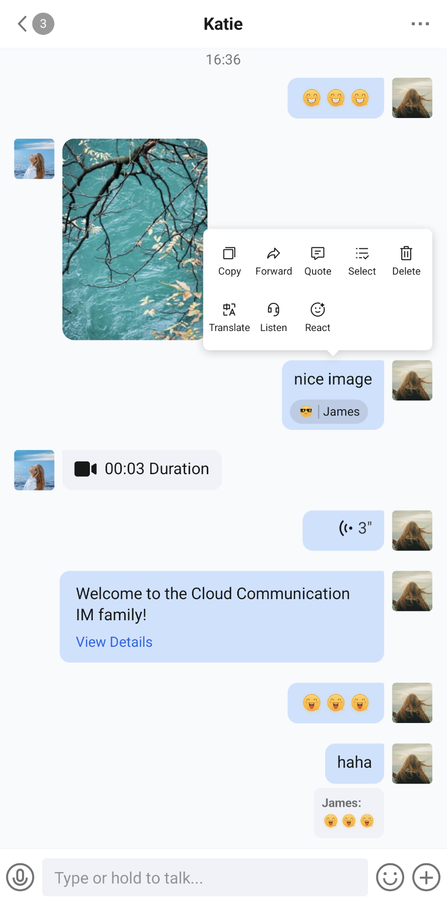 | 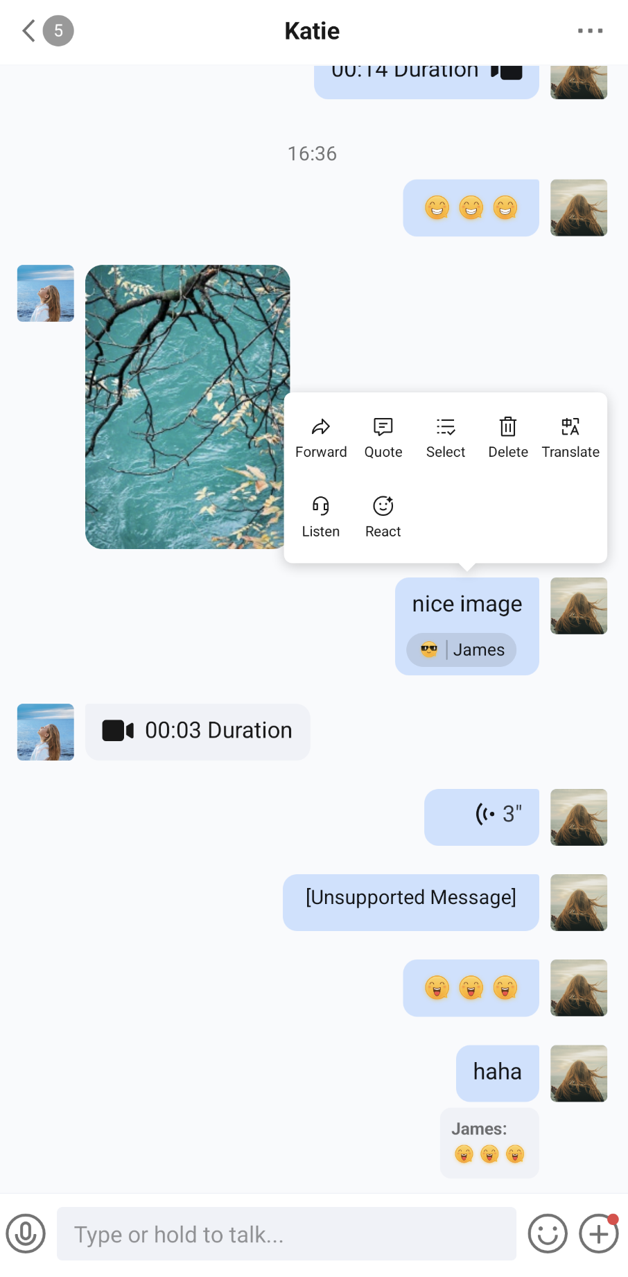 |  |